Image Details
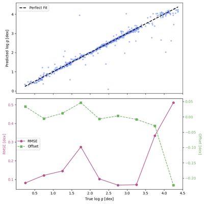
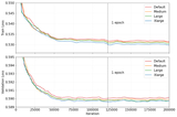
Caption: Figure 8.
Comparison of predicted and true surface gravity values (log g) using FALCO. The top panel shows the predicted log g values (y-axis) plotted against the true log g values (x-axis), with the dashed black line representing a perfect fit. The scatter of points illustrates the accuracy of the predictions, with the majority clustering around the perfect fit line. The bottom panel provides a quantitative assessment of the prediction performance across different log g intervals. The purple line represents RMSE in dex, indicating the average prediction error for each interval, while the green dashed line shows the offset (mean prediction bias) for the same intervals. The offset values reveal systematic deviations. This figure demonstrates the effectiveness of FALCO in surface gravity estimation and highlights areas where the model performs robustly or exhibits potential biases.
Other Images in This Article
Show More
Copyright and Terms & Conditions
© 2025. The Author(s). Published by the American Astronomical Society.