Image Details
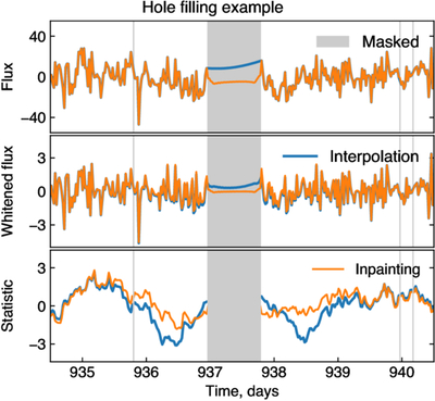
Caption: Figure 8.
Example of the inpainting filter compared to linear interpolation (shown for target KIC007742408). Gray regions represent masked points. Blue lines depict data with gaps filled using linear interpolation. Orange lines correspond to the gap filling with the inpainting filter. Top panel: Kepler flux. Interpolation just connects the two points outside the mask. The inpainting filter fills the gap as described in the text, leaving data outside the gaps unchanged. Middle panel: flux after applying the whitening filter. Cross talk between points inside and outside the gap modifies the data outside the gap in the linear interpolation case. Bottom panel: statistic score after matched filtering with a template. The blue line corresponding to linear interpolation exhibits two dips which might mimic transits. The inpainted orange line does not contain these peaks.
Other Images in This Article
Show More
Copyright and Terms & Conditions
© 2025. The Author(s). Published by the American Astronomical Society.