Image Details
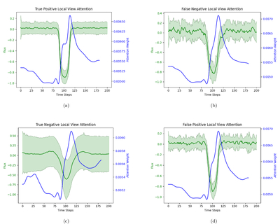
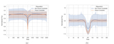
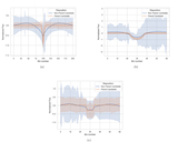
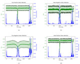
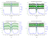
Caption: Figure 10.
Visualization of attention weights learned by the Optimized with Attention model for each data point in the local view from the Kepler data set. Attention weights are depicted using a blue line. The average of light-curve views from the test set is shown with a green line, with standard deviation represented by shaded areas around the mean. This visualization is separately displayed for (a) true positive, (b) false negative, (c) true negative, and (d) false positive groups of test instances.
Other Images in This Article
Show More
Copyright and Terms & Conditions
© 2025. The Author(s). Published by the American Astronomical Society.
Copyright ©
2026 Astronomy Image Explorer. All Rights Reserved.