Image Details
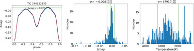
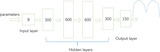
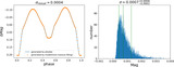
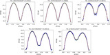
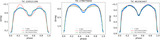
Caption: Figure 1.
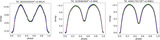
Left: the blue dots represent the raw light-curve data, while the red line indicates the fitting results. The green lines emphasize the Max. I and Max. II points within the light curves. Middle: the graph illustrates the Δmag = Max. I–Max. II distribution specifically for 338 light curves. Right: the distribution of effective temperatures.
Other Images in This Article
Copyright and Terms & Conditions
© 2025. The Author(s). Published by the American Astronomical Society.
Copyright ©
2026 Astronomy Image Explorer. All Rights Reserved.