Image Details
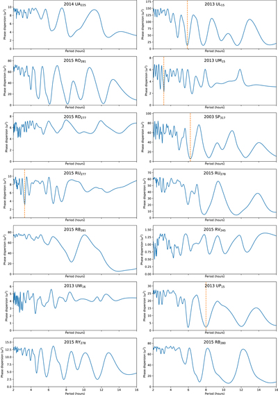
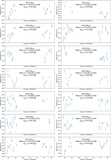
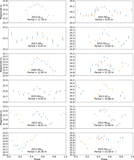
Caption: Figure 10.
PDM plot from our period analysis. Vertical dashed orange lines show our favored single-peak period for the objects listed in Table 6 and shown in Figure 8. Objects 0–13, ordered by average magnitude shown here.
1 of 4 images
Other Images in This Article
Show More
Copyright and Terms & Conditions
© 2019. The American Astronomical Society. All rights reserved.
Copyright ©
2025 Astronomy Image Explorer. All Rights Reserved.