Image Details
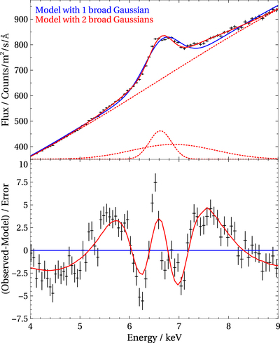
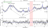
Caption: Figure 3.
EPIC pn spectrum of the high state from observation 0865440501 (80 ks clean exposure), focusing on the Fe K region. The data are shown in the top plot in black (error bars are so small they are difficult to see in the spectrum). The blue curve shows the best-fitting model containing one broad Gaussian, while the red curve corresponds to the model containing two broad Gaussian lines. The red dashed lines in the top subplot are the individual spectral components in the more complex, two-Gaussian model. The Gaussian components are shifted by a constant amount for better visual clarity. The bottom subplot shows the residuals to the blue model in black, as well as how the model with two Gaussians fits the data (in red).
Other Images in This Article

Show More
Copyright and Terms & Conditions
© 2022. The Author(s). Published by the American Astronomical Society.