Image Details
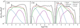
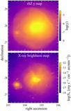
Caption: Figure 9.
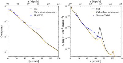
Left panel: the Compton y-profile (azimuthally averaged) for the Coma cluster. The data points, taken from Mirakhor & Walker (2020, private communication), are the measurements from Planck, and the lines show the results from our CM simulation. The solid black line shows the result averaged over the whole Coma cluster, while the dashed curve shows the result after the removal of the most significant substructure (see Figure 10). To compare with the observational data, the simulation result is smoothed with a ﹩\mathrm{FWHM}=10^{\prime} ﹩. Right panel: the surface brightness profile of X-rays in the band of 0.7–7.0 keV for the Coma cluster. The data points are based on Newton-XMM observations (Mirakhor & Walker 2020, private communication), and the two lines show results with and without the substructure removed, respectively.
Other Images in This Article
Show More
Copyright and Terms & Conditions
© 2022. The Author(s). Published by the American Astronomical Society.