Image Details
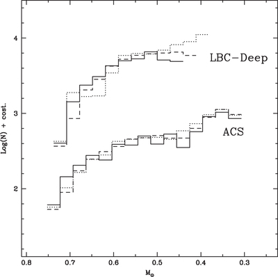
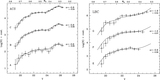
Caption: Figure 5.
Direct comparison among the observed LFs in the ACS and in the LBC data sets. For both data sets, the solid line represents the most internal region, the dashed line shows the region at intermediate distance, while the dotted line is used for the one located at larger distance respect to the others in the same data set.
Other Images in This Article
Copyright and Terms & Conditions
© 2015. The American Astronomical Society. All rights reserved.
Copyright ©
2025 Astronomy Image Explorer. All Rights Reserved.