Image Details
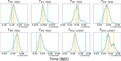
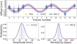
Caption: Figure 6.
Individual transit midpoint posteriors for each transit in our data set. In each plot, the orange region corresponds to the 68% highest-posterior-density region, and the blue line shows where the best-fitting linear ephemeris would predict the midpoint to fall. Gray dashed curves show the Gaussian prior placed on these midpoint timings.
Other Images in This Article

Copyright and Terms & Conditions
© 2023. The Author(s). Published by the American Astronomical Society.
Copyright ©
2025 Astronomy Image Explorer. All Rights Reserved.