Image Details
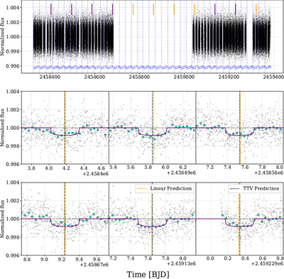
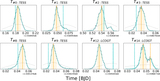
Caption: Figure 1.
First row: sector-by-sector PDCSAP flux, normalized to within-sector median. Purple bars indicate where transits were detected, orange bars indicate where expected transits fell in observing gaps. Rows 2 and 3: zoomed plot of each of the six caught transits. The TESS data were taken at a cadence of 2 minutes and are shown binned to 60 minute intervals with cyan points. The displayed transit model is described in Sections 3 and 4. Orange vertical lines show the predicted midpoints given a fixed-period ephemeris. Dashed black lines indicate the fitted midpoints, showing TTVs described in Section 3.4.
Other Images in This Article

Copyright and Terms & Conditions
© 2023. The Author(s). Published by the American Astronomical Society.
Copyright ©
2025 Astronomy Image Explorer. All Rights Reserved.