Image Details
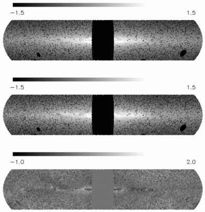
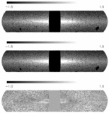
Caption: Fig. 8.
Sky maps of the observed J‐band emission (top), the predicted J‐band emission from the stellar distribution model (middle), and the relative difference map between model and data (bottom). Black pixels in the upper two maps show pixels removed from the data set, due to blanking out selected regions, such as the Galactic center, or rejected point sources. Upper two maps are on a log scale, while the bottom is on a linear scale.
Other Images in This Article

Show More
Copyright and Terms & Conditions
© 2001. The American Astronomical Society. All rights reserved. Printed in U.S.A.
Copyright ©
2025 Astronomy Image Explorer. All Rights Reserved.