Image Details
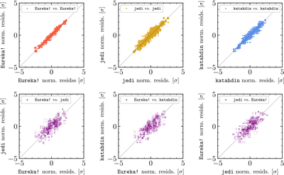
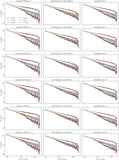
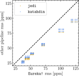
Caption: Figure 3.
Correlations between the different light curves plotted in Figure 2. Each point represents a comparison between two different reductions at a single data point; the panels in the top row are limited to comparisons between reductions that used different settings of the same underlying pipeline, while the panels in the bottom row show comparisons between reductions created with different pipelines. As noted, the three pipelines tend to agree, and light curves derived from the same pipeline using different settings are even more strongly correlated.
Other Images in This Article
Show More
Copyright and Terms & Conditions
© 2026. The Author(s). Published by the American Astronomical Society.
Copyright ©
2026 Astronomy Image Explorer. All Rights Reserved.