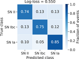
Image Details
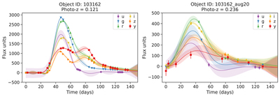
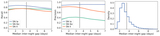
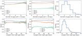
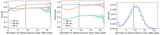
Caption: Figure 4.
The left panel shows an SN Ibc light curve where the points show the observations, along with their error bars, and the lines and the shaded regions show the mean and standard deviation of the GP fit, respectively. The right panel shows a synthetic event at a different redshift generated from the original event using the procedure described in Section 4. Note that, in this example, the original event was simulated in the higher-cadence DDF survey, and we generated the synthetic event in the WFD survey.
Other Images in This Article
Show More
Copyright and Terms & Conditions
© 2022. The Author(s). Published by the American Astronomical Society.
Copyright ©
2025 Astronomy Image Explorer. All Rights Reserved.