Image Details
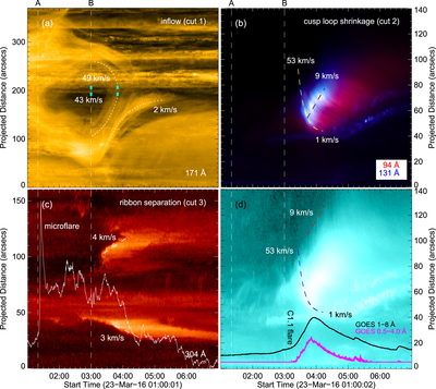
Caption: Figure 2.
(a) Time slice of cut 1 for the evolution of the inflow threads. The two cyan boxes at 03:00 UT and also 03:50 UT show the positions used for DEM analysis in Section 2.4, as in Figures 1(c) and (d). The speeds given are for the final times of the fit curves. (b) Time slice of cut 2 combines 94 Å and 131 Å on a linear intensity scale, showing the evolution of the bright cusp. Its corresponding image on a logarithmic intensity scale in 131 Å is plotted in panel (d). The yellow dashed fit curve is the same as the blue one in panel (d), and the black dashed fit curve is the same as the red one in panel (d) but moved downward to match the brightest portion. (c) Time slice of cut 3 for the evolution of the ribbons. The light curve in 304 Å of the microflare indicated in Figure 1(b) is overlaid. (d) GOES SXR light curves overlaid on the time slice image of cut 2 in 131 Å on a logarithmic intensity scale for reference. The dotted line A denotes the timings of the arcade eruption and the microflare and B the timings of the inflow and the C1.1 flare.
Other Images in This Article
Copyright and Terms & Conditions
© 2017. The American Astronomical Society. All rights reserved.