Image Details
Caption: Figure 2.
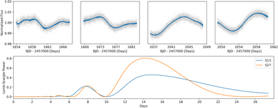
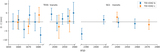
Top: SPOC SAP light curve with our correction trend (described in Section 2.1) in blue. This trend, formed from quaternion data and basis splines to remove systematics and long-timescale variability, is divided out of the raw light curve to create our final flattened light curve. Bottom: Lomb–Scargle periodograms of the SAP SPOC light curve for each sector of observation. We see peaks around 14 days marking stellar variability, but we cannot pin down a specific period due to the large gap between observations.
Other Images in This Article
Copyright and Terms & Conditions
© 2023. The Author(s). Published by the American Astronomical Society.
Copyright ©
2025 Astronomy Image Explorer. All Rights Reserved.