Image Details
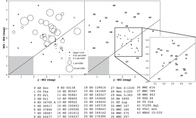
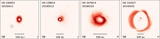
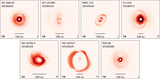
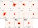
Caption: Figure 15.
Infrared color–color plot (left) of the targets where the size of the circle corresponds to the magnitude of the Q ϕ /Fstar ratio. Note that the size of the circles is logarithmic. The color–color diagram is the same as that shown in Figure 1 where colors are using 2MASS J-band magnitudes and WISE 2 (4.6 μm) and 4 (22 μm) bands representing near-infrared excess (J–W2) and mid-infrared excess (W2–W4). The dashed line represents a flat spectrum SED. The gray shaded region marks objects with no near-infrared or mid-infrared excess. The color–color diagram (right) labels each target with the corresponding number and target name on the bottom of the figure. The Q ϕ /Fstar ratios plotted are the weighted average for each target. The individual Q ϕ /Fstar values can be found in Table 2.
Other Images in This Article
Show More
Copyright and Terms & Conditions
© 2022. The Author(s). Published by the American Astronomical Society.