Image Details

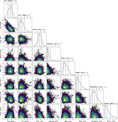
Caption: Figure 10.
Corner plot showing relationship between endmember percentage abundances for the SPHERE fit in Powys Regio. The shaded 2D histograms give the posterior abundance distribution, with brighter colors indicating a higher density. In low-density regions toward the edge of the distribution, individual points of the distribution are plotted. For clarity, some endmembers have been combined. Circular distributions imply no strong correlation between the abundance distributions of the two endmembers, whereas skewed distributions imply a correlation between the abundances of those endmembers.
Copyright and Terms & Conditions
© 2022. The Author(s). Published by the American Astronomical Society.


