

Image Details
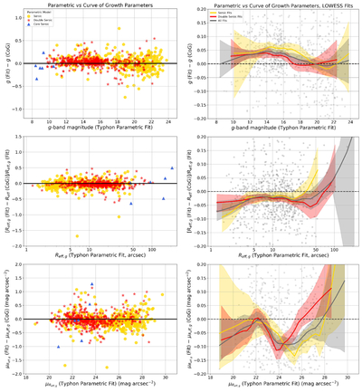
Caption: Figure 18.
Left panels: comparison of g-band magnitude, geometric effective radius Reff, and surface brightness at Reff, ﹩{\mu }_{{R}_{{\rm{eff}}}}﹩, derived from Typhon’s parametric fits to the surface-brightness profile (identified with the suffix “Fit”) and from the curve-of-growth analysis (identified with the suffix “CoG”), as described in Section 5.1. The 897 galaxies analyzed with Typhon are color coded according to the components included in fitting the profile: Sérsic, double Sérsic, or core Sérsic, as shown in the legend. See the text for further details. Right panels: as the left panels, but showing locally weighted scatterplot smooth (LOWESS) fits and associated 95% confidence limits to the data. The fits are performed for the entire sample and separately for galaxies fitted with a Sérsic and double-Sérsic profile, as shown in the legend. Data points are shown as gray dots; note, however, that to better show the fits, the y-axis has been expanded compared to the left panels and some points fall outside the range plotted.
Other Images in This Article
Show More
Copyright and Terms & Conditions
© 2026. The Author(s). Published by the American Astronomical Society.

