Image Details
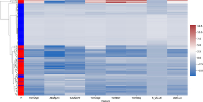
Caption: Figure 13.
Clustering heat map of 200 samples from each class. In the “y” column red corresponds to a flare-positive sample and blue corresponds to a flare-negative sample. All features have been z-score normalized for visualization purposes.
Other Images in This Article
Show More
Copyright and Terms & Conditions
© 2026. The Author(s). Published by the American Astronomical Society.
Copyright ©
2026 Astronomy Image Explorer. All Rights Reserved.