

Image Details
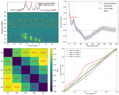
Caption: Figure 3.
Upper left: the dynamic spectrum of FRB 20181028A without the RFI. Upper right: the blue line shows the autocorrelation of the light curve. The orange dashed line represents a Gaussian-smoothed version of the autocorrelation. The gray dashed–dotted lines indicate the 3σ. The red dashed line marks a location with a strong autocorrelation exceeding the 3σ threshold, corresponding to a time delay of Δt = 15.68 ms. Lower left: as indicated by the peaks marked in the dynamic spectrum, the heatmap shows the differences in the CDFs between peaks as a function of frequency separation. The color scale represents the maximum distance ﹩{D}_{{\rm{\max }}}﹩ from the K-S test, while the numerical values indicate the separation between peaks. A red star is assigned to any pair of peaks where ﹩{D}_{{\rm{\max }}}\gt 0.1﹩ and exceeds the 3σ noise level, marking the presence of a severe frequency drift between peak i and peak j. Lower right: for comparison with the heatmap, the Q–Q plot of the frequency spectral distribution between peaks is presented, where the highlighted solid lines indicate the peak pairs exhibiting significant frequency drift just like the peak pairs marked in the lower-left heatmap.
Other Images in This Article
Copyright and Terms & Conditions
© 2026. The Author(s). Published by the American Astronomical Society.

