Image Details
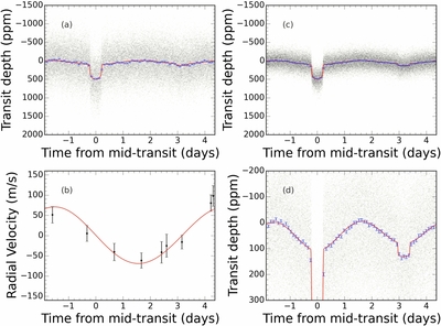
Caption: Figure 4.
Observed data is shown in black, the best fitting model in red, and binned data is shown in blue. The data have been folded on the orbital period of the planet. Panel (a) shows the observed data as black semi-transparent points, the large scatter is due to correlated noise in the observed data which has not been modeled in this plot. The blue points shown are binned observed data with 1000 observed points included per bin. The red curve is the best fitting light curve model, excluding the noise model. Panel (b) shows our observed radial velocity data in black and the best fitting model in red folded on the same phase as the Kepler data. Panel (c) is the same as panel (a) but the mean Gaussian Process noise model has been subtracted from the observed data. The scatter on the data is the white noise component of the noise plus any remaining correlated noise we have not modeled. Panel (d) is a zoom in on panel (c) to show the phase variations from Kepler-91b and the secondary eclipse.
Other Images in This Article
Show More
Copyright and Terms & Conditions
© 2015. The American Astronomical Society. All rights reserved.