Image Details
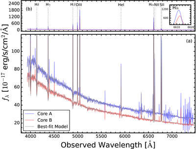
Caption: Figure 4.
The integrated spectra of Core A (blue line) and Core B (red line). Gray lines represent the best-fit model spectra. Panels (a) and (b) show the same data but with different y-axis ranges. The inset of panel (b) highlights the difference in the peak wavelengths of the Hα emission line.
Other Images in This Article
Copyright and Terms & Conditions
© 2026. The Author(s). Published by the American Astronomical Society.
Copyright ©
2026 Astronomy Image Explorer. All Rights Reserved.