Image Details
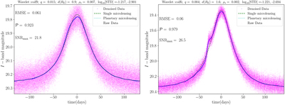
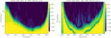
Caption: Figure 1.
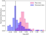
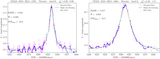
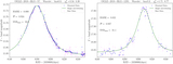
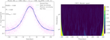
Two examples of simulated planetary microlensing light curves (dotted cyan curves), and the corresponding single microlensing events (setting q = 0; dashed green curves). In each panel, the raw and denoised data are represented with pink and blue colors, respectively. The best-performing wavelet for denoising and the used planetary lensing parameters are shown at the top of panels. Two given values for ﹩{\mathrm{log}}_{10}[\mathrm{STD}(\mathrm{mag})]﹩ correspond to raw and denoised data, respectively.
Other Images in This Article
Copyright and Terms & Conditions
© 2023. The Author(s). Published by the American Astronomical Society.
Copyright ©
2026 Astronomy Image Explorer. All Rights Reserved.