Image Details
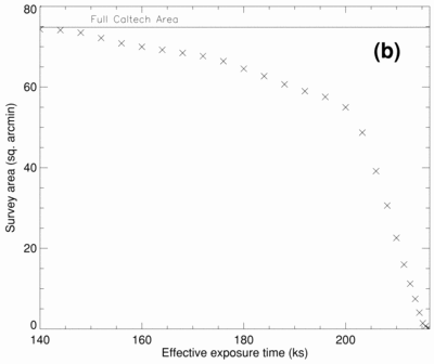
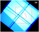
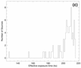
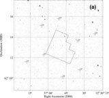
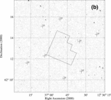
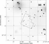
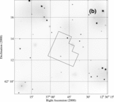
Caption: Fig. 1.
(a) Combined exposure map for the four ACIS‐I observations. The whitest regions correspond to the highest exposure times. The dark grooves running through the exposure map correspond to the gaps between the ACIS‐I CCDs. North is up, and east is to the left. The large square indicates the Caltech area, which is ﹩8\farcm 6\times 8\farcm 7﹩. The small polygon indicates the HDF‐N. (b) Observed survey area for the Caltech area as a function of effective exposure time in that area. Approximately 75% of the Caltech area has an effective exposure time of greater than 200 ks, which corresponds to the whitest regions in the exposure map. (c) Distribution of effective exposure times for the 82 X‐ray sources detected in the Caltech area.
Other Images in This Article

Show More
Copyright and Terms & Conditions
© 2001. The American Astronomical Society. All rights reserved. Printed in U.S.A.