Image Details
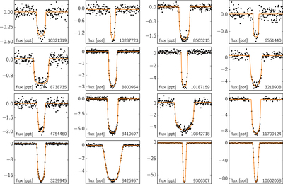
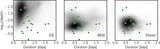
Caption: Figure 4.
Sections of PDC light curve centered on each candidate (black) with the posterior-median transit model overplotted (orange). The y-axis shows the relative apparent flux of the light curve in parts per thousand (ppt). Candidates with two transits are folded on the posterior-median period. The plots are ordered by increasing planetary radius from the top left to the bottom right.
Other Images in This Article

Copyright and Terms & Conditions
© 2016. The American Astronomical Society. All rights reserved.
Copyright ©
2025 Astronomy Image Explorer. All Rights Reserved.