Image Details
Caption: Figure 1.
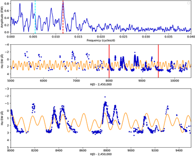
A multi-panel plot from the Fourier analysis. The first panel is a plot of the frequencies found in the Fourier transform versus the amplitudes for the Hα line. The cyan line is the frequency at 0.005423 day−1 and the red line is the frequency at 0.011499 day−1. The middle panel shows the fit of the Hα data from 2003 to 2026. The last panel is a zoom in of the middle panel plot at the section between the solid red lines. The solid line represents the fit from the Period04 analysis. The Hα and Hβ equivalent widths is available in machine readable format as the data behind this figure.
(The data used to create this figure are available in the online article.)
(The data used to create this figure are available.)
Copyright and Terms & Conditions
© 2026. The Author(s). Published by the American Astronomical Society.