Image Details
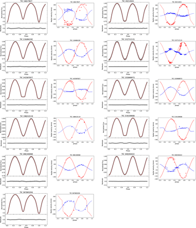
Caption: Figure 1.
These figures display the theoretical light curves and radial velocity curves for 11 targets. In the light-curve fitting diagrams, the gray dots represent the observed data, and the red lines indicate the fitted theoretical curve. In the radial velocity diagrams, blue dots and lines denotes the more massive primary component, while red ones signifies the less massive secondary component.
Other Images in This Article
Copyright and Terms & Conditions
© 2026. The Author(s). Published by the American Astronomical Society.
Copyright ©
2026 Astronomy Image Explorer. All Rights Reserved.