Image Details
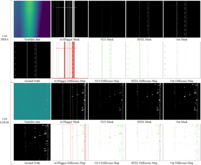
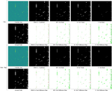
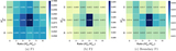
Caption: Figure 6.
Visual examples for the proposed method and the compared approaches. The figure is split into two regions, showing results on HERA (top) and LOFAR (bottom). In each subfigure, the x-axis denotes frequency channels and the y-axis denotes subintegrations. For each region, the first column on the left shows the input time–frequency visibility data and its ground truth. The four columns on the right present, in order, the segmentation masks predicted by different methods (top row) and their difference maps relative to the ground truth (bottom row). Difference maps are computed as the absolute difference between the predicted masks and the ground truth. Red indicates false positives, and green indicates false negatives. The less area red + green covers, the better the performance is.
Other Images in This Article
Show More
Copyright and Terms & Conditions
© 2026. The Author(s). Published by the American Astronomical Society.