Image Details
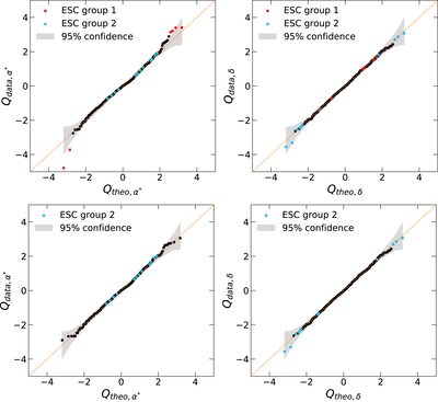
Caption: Figure 6.
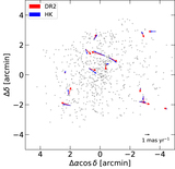
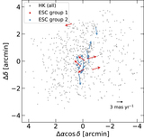
The Q–Q plots to assess the normality of the stellar PM distribution, comparing data quantiles to theoretical Gaussian quantiles. The dotted lines mark the expected values of the theoretical distribution. The gray regions illustrate 95% point-wise confidence envelopes. The upper and lower panels show before and after removing ESC group 1 from our sample.
Other Images in This Article
Copyright and Terms & Conditions
© 2019. The American Astronomical Society. All rights reserved.
Copyright ©
2024 Astronomy Image Explorer. All Rights Reserved.